Critique Me!
October 25th, 2006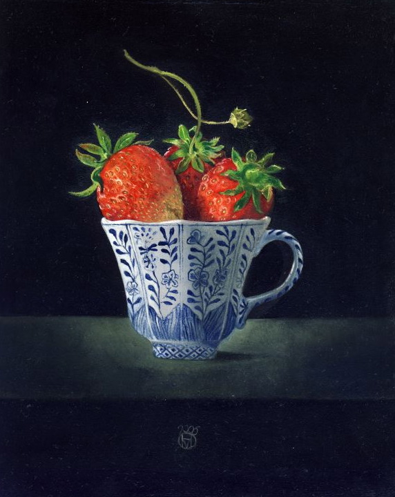
Posted by Hanneke van Oosterhout
This still life is about 13 cm wide. I painted everything from life. I drew directly on the panel with charcoal, then pencil. Then I made an under painting in acrylic in one day. I made the over painting oil in two days, one day focusing on the berries, the other on the cup. I think this is a good picture. Please tell me what could be done better. Photographers, have you any insights for me?
. . .
October 23rd, 2006 at 5:44 am
A technical comment – the picture file does not seem to have a colour profile embedded. This means that the colours that viewers will see will depend on the browser that they are using, not what you intended when painting.
sRGB is normally considered the safest profile to use (alll known browsers can deal with it).
It can make a surprising difference, which you may not notice if you are preparing the file on a Mac (as Safari consistently makes better guesses than any Windows browser due to differences in the way that the operating systems deal with colour).
It is a long and tedious subject. I can suggest a source of tutorial information, or, if you are using a recent version of Photoshop, I can tell you how to embed sRGB.
October 25th, 2006 at 7:00 am
Ah. At last I am through with all the technical, computer related work I was doing for Karl’s new site. I was just going to go to bed when I looked at your post and then looked at this lovely painting.
It is marvelous how each object in this work has its own texture. The strawberries glisten like strawberries. The leaves are fuzzy and soft. The pottery (in the US we call it “Delft”) shines delicately while the blue glaze looks just like the blue of that famous style. Rubens, that master of texture, would be delighted.
The contrast between the main subject and the background is dramatic. I like the the sharpness of the light and the mystery of of its absence.
Very fine.
There is a teetery aspect here too. The largeness of the strawberries contrasts with the tininess of the cup. The little tendril rising up puts just enough tension in the composition so that this is not a perfectly static design. It has a subtle motion that belies the apparent simplicity.
If I were to state one thing that is a not perfect, it is the line of the base of the cup. My eye expects to see a bit more curve there. I know this cup is small, so the effect is subtle; even so, as one would see a section of circle not quite so edge on. There should be a trace of an ellipse not exactly parallel to the shape of the brim but a little more curved. And so the cup does not quite sit exactly right on the ground. That shape and a slight lack of reflected light in the shadow on the table near the edge of the right side base of the cup serve to disconnect the cup ever so slightly from the ground.
Am I nitpicking? Probably, but when a painting is this well wrought, there is only nitpicking left. Thank you for posting this. I look forward to seeing more of your beautiful work.
October 25th, 2006 at 2:10 pm
Hi Hanneke, this is a beautiful painting!
I agree w/ Rex about the ellipse of the base and the shape of the shadow.
A couple more small points that might help:
_You might consider adding one or two bright specular highlights, perhaps one on a strawberry and one on the rim of the cup. It would emphasize the shininess of the surfaces and add focal points for the eye.
_Also, you might want to add a little more light hitting the table in front of and to the left of the cup. The shadow tells us that the light is coming directly from the left, but the table is brightest behind the right side of the cup.
Again, beautiful painting. These are just small points.
October 25th, 2006 at 3:20 pm
Oh, this is cruel. Don’t you know that there won’t be any strawberries (or at least strawberries that taste of anything) for months and months.
This is not just a cup of strawberries, it is a cornet, and an overflowing one at that. These are strawberries as temptation.
I’ve read the other comments about the base of the cup and the effect of the cup not quite sitting on the ground, and am thinking that this was deliberate. To me these features reduce the realness ever so slightly, but increase the impact of the strawberries. They are bursting upon the world. The cup is behind them, and beneath them in both senses.
Colin
October 25th, 2006 at 4:01 pm
Agreed. Comments are nothing more than potentially useful information for the artist. If they point out things she hadn’t noticed, they may be helpful.
October 25th, 2006 at 6:56 pm
Hi Hanneke,
From what I’ve seen of your work, and the sound of your name, I envision you sitting in your studio working away not unlike Vermeer. No need to re-state anything that has already been said in regards to this work. You create a very “dynamic” still. The power of the subject in your work is enhanced by the lack of distractions. The overall effect is emphasized by the “theater lighting, which is dramatic, eye catching, and enables one to easily focus on the subject. I would love to see more of your work.
October 25th, 2006 at 7:34 pm
This is a lovely picture. What I find most striking about it — aside from the dramatic dark background — are two things not mentioned yet. These are the rich colors, with the contrasting red/green in direct contact and the red/blue nicely mediated by the white of the cup, and the strong three-dimensionality, which is especially prominent against the flat background. I especially admired the progressive darkening on the cup from left to right, turning away from the light source. I do have a question here: it seems the rightmost sector is lighter again, which would be expected by reflection if the background were light in color, but seems a bit odd with the dark background. The strawberries are also nicely modeled, though the left one less than the others. These remarks are not meant as criticisms, I’m just wondering how important that was to you while painting, and whether you were deliberately striving for 3D or it just happened as a consequence of close observation.
Steve
October 26th, 2006 at 10:02 am
I am delighted with these comments and I could work really well today in the studio knowing that people appreciate my work. It gives me energy.
October 26th, 2006 at 10:32 am
Rex, David, Colin, Jon and Steve,
I believe that you like this painting. I was happy when we had it in our home. It is now sold and somewhere in Africa with a person who works with the U.N.
I think all of the points you made are good ones. With a work like this, there is a certain ambiguity. The flaw could be the mark of perfection. Or it could be a flaw. Hanneke is my partner, so I’ll choose to see things in the positive light, at least on this one.
Steve, Could you clarify your question about the lightness on the “rightmost sector”?
October 26th, 2006 at 11:57 am
I do like the painting. None of the things I pointed out were flaws. They were just other options.
October 26th, 2006 at 12:21 pm
About my question. I hope it is clear that the rightmost quarter of the cup body (separated by vertical lines) is lighter than the quarter next to it. This is what I expect and observed if the cup is on a light surface, but not what I would expect (or observed in a crude test) on a dark surface. So I’m wondering:
1) how important the 3D-ness was to Hanneke as she painted;
2) whether the cup was actually painted on a light background, which was then made dark for other pictorial reasons; or
3) whether I’m just off-base altogether and over-analyzing this.
I emphasize that I don’t consider these questions crucial to the success of the picture. It’s just that I am interested in such questions — as a photographer I care a lot about lighting and its effects — and Hanneke’s work has seemed quite carefully observed to me.
October 26th, 2006 at 1:58 pm
Hi Steve,
I talked to Hanneke and here is what she has to say. First let me thank you for looking so carefully.
0) The right side should not be lighter, unless of course there is another light source on that side. Hanneke’s studio has some windows on the far right side that are covered with paper; but they do let some light in. That is what she and you are observing, most probably. The main light source is of course on the left.
1) The 3-D quality is important to Hanneke, yes.
2) The cup was painted against a dark background, as seen in the picture.
3) I’m glad that you take an interest in the lighting issues. If Hanneke had put the still life into a box with a window on the left (for the light) and the front (to see in), the lighting would be different. This is an interesting option for the future. As it is, the picture has light and shade, but it is a bit unusual as you point out. This might be a good thing. It would be good to look at the alternatives in the future.
What do you think about the composition? It seems to me quite restrained, but this might be fitting for this particular image.
Would it be difficult to set up a still life and capture the feeling of this painting using direct photography? I’m curious. I have no experience in this.
October 26th, 2006 at 2:42 pm
Hi Karl and Hanneke,
Thank you for the interesting response on the lighting questions. As for the composition, I think it is quite appropriate for the evident subject of “strawberrries and cup.” I do prefer the less static composition obtained by cropping right and bottom, which by implication points toward the off-image light source upper left. If I were looking for a painting to hang in my home or other place I would frequently see it, I would want something with more story behind it. If the background were still dark, but represented, say, a kitchen or dining room, then many stories become possible. Maybe it’s dawn and these berries were picked the day before and left for someone’s breakfast (perhaps as a surprise gift). Maybe the view through a window shows that it’s winter and these are special, expensive berries. Whatever it is, it would enable a much richer visual experience exploring the whole frame, as well as a richer emotional experience. Obviously, that would be a different picture.
Your question about capturing the feel with photography is very interesting, and I would like to see a photographer and a painter tackle the same subject with the same goal. I expect the online image could be matched quite easily by an artistic photographer, but one thing I like about painting is the tactility that comes from the brushstrokes.
October 26th, 2006 at 3:19 pm
Steve,
Colin wrote “It is an old saw within photography that the negative is the score and the print is the performance. Digital photography hasn’t changed this basic idea.”
The image here is based on a 1200 dpi scan in jpg format. It is 14 MB in size. Is this a print, or a negative? If it is a negative, what scope is there for the performance?
You wrote “one thing I like about painting is the tactility that comes from the brushstrokes.” In the 14 MB file, you can see a great amount of the detail of the brushstrokes.
Could a photographer do something interesting with such a file that might not have occurred to Hanneke? Could a photographer take this file and use it to create an original work?
October 26th, 2006 at 4:55 pm
Your jpg would best be considered a negative, but as is clear from the fact that it is a scan of a painting, all these forms can now be interconverted fairly easily, so the distinction is less clear. Normally information is lost at each conversion, though, and your jpg has less tonal range (8 bits) than the raw files I shoot (12 bits), not to mention noise and loss of resolution.
No doubt a digital artist (photographer or not) could create a different work of art from that file, though you could question how “original” it would be. As a matter of fact, when studying the shading of the cup, I took the online (low resolution) file and changed the shading. It did look more natural to me with it darker on the right, though of course I wasn’t aware of the light source over there; it isn’t obvious in the shadows on the table. Changing tonality can strongly affect the impact of an image, and it wouldn’t be hard to make this one feel quite different. Of course, there are more drastic opportunities like combining this with other images. However, as Colin said, it can easily seem forced if it isn’t the work of an artist who cares personally about the result.
October 27th, 2006 at 4:50 am
Karl,
Taking a finished original and corrupting it through a scan to produce something new could be argued to be something other than what is meant by the score and performance thing. However, the interesting part of your question to me is:
Could a photographer do something interesting …… that might not have occurred to Hanneke?
The first thing that I did when I grabbed the web version was to turn it monochromatic. Most of my pictures are black and white and this probably gives me a different way of seeing the subject than Hanneke. The resulting mono picture, interestingly, becomes a picture of the cup in use, rather than a picture of strawberries supported by a cup. The focus of interest becomes the painted design on the cup. It is not such a striking picture that way, but it is something that someone might conceivably produce.
The other thing I did was to experiment with the relationship between cup and background. Given how unimportant the background is as painted, I reduced the background still further. This sort of experimentation is easy digitally, of course, but similar things have always been done as ‘what if’ exercises.
Steve has already made the point about the loss of information in creating an 8 bit jpg (quite possibly your scanner could produce 12 or 14 bit tiffs). A 14mb file would be considered fairly small as a scan from an original this size. Onwards manipulation of something that has already gone through a lossey compression quickly results in artefacts that become ugly.
I didn’t mention the lighting to begin with as this is hardly my specialty, but to my eyes the multiple light sources are clear. The thing that stands out is the strength of the base shadow. Given the multiple light sources, this shadow seems too deep.
The question of a textured surface to the artwork and the tactile nature that this gives is an interesting one. Traditionally colour photos have not had a surface that has been important to the photo, whilst some monochrome workers have used the paper surface as an important element.
The choice of paper surface has increased greatly for photographers who use ink rather than silver. This doesn’t show up on the web because nobody much prints a print to scan for the web. The web versions are compressed copies of the print file.
Colin
October 27th, 2006 at 5:56 am
Colin and Steve,
I would be fascinated to see what the two of you have already done with this image. Would it be worthwhile uploading the 14 MB file for anyone who wants to experiment with it?
October 27th, 2006 at 7:34 am
The image here.
October 27th, 2006 at 11:09 am
Karl,
The interesting thing might be to sit down with you and see what could be done. No doubt we’d both learn something. But playing around on my own and then sending you a new version is too low-bandwidth to be useful unless I have a particular vision of what I’d like to do, which at the moment I don’t. And I’m too busy doing final work on my own images for a show next week…
October 27th, 2006 at 11:43 am
No problem, Steve. This discussion and Colin’s “Score and Performance” post have inspired me to play around with this image. I’ve no idea what I’m looking for, but the close-up details are fascinating.
October 27th, 2006 at 12:40 pm
Someone reported a problem downloading the 14 MB image. It appeared to be damaged. I downloaded it myself and it seems fine. The large size might cause a problem with the transfer.
October 27th, 2006 at 4:12 pm
this is fabulous. i think my reaction is that it can’t get any better!
but if you insist, i think the right hand side, where it’s in the shade, you could go a little darker to enhance the contrast.
Homa
October 28th, 2006 at 8:13 pm
Your paintings are always stunning but what I like the most of it is the delicious subjects so luscious painted that makes its so appealing!